UPS.com
Homepage Retrospect
Rethinking a homepage through testing, not assumptions.
Case Study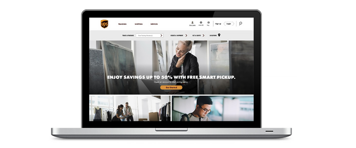
Challenge
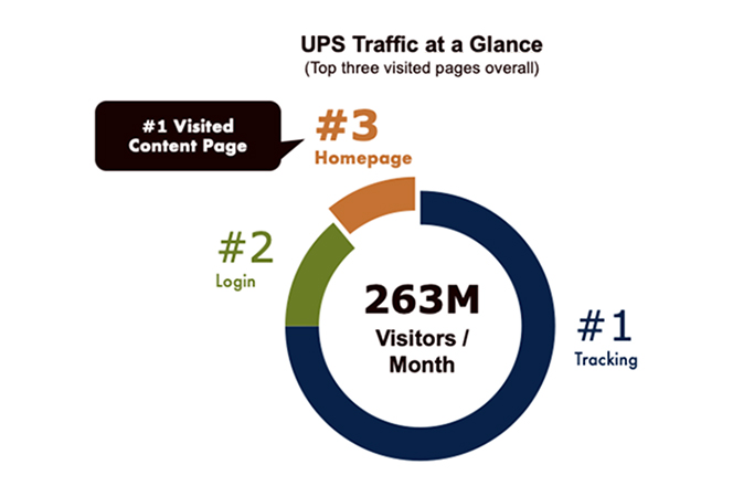
The Digital Experience team needed to understand how users engaged with the homepage while ensuring it effectively served multiple purposes. The homepage needed to guide users to supporting content pages, establish the brand’s visual identity and tone, and communicate key messaging around services and products. Balancing these priorities required creating a clear, intuitive experience that supported navigation, branding, and promotion without overwhelming users.
Approach
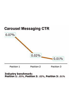
Current data show that the components on today’s homepage and its design underperform at messaging and creating engagement.
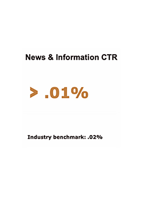
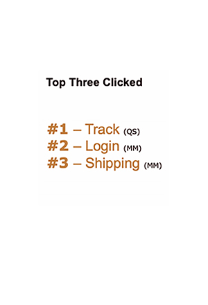
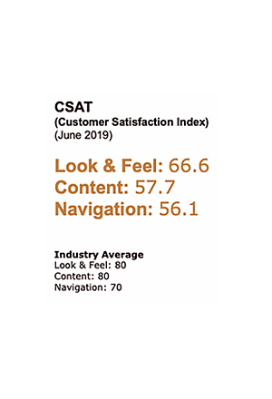
“UPS homepage is missing on opportunities to promote its brand and connect with its audience.”Internal User
Testing Design Variations
With the pre-findings data and knowledge of current user behavior, we evolved the home page to reflect current industries’ best practices for page engagement.
- Removing the carousel
- Implementing content blocks for messaging
- Reducing content copy
- Introduction of a utility strip for quicker transactions
- Addition of marketing segment blocks
This design approach was achieved by testing new components that create flexibility in the CMS.
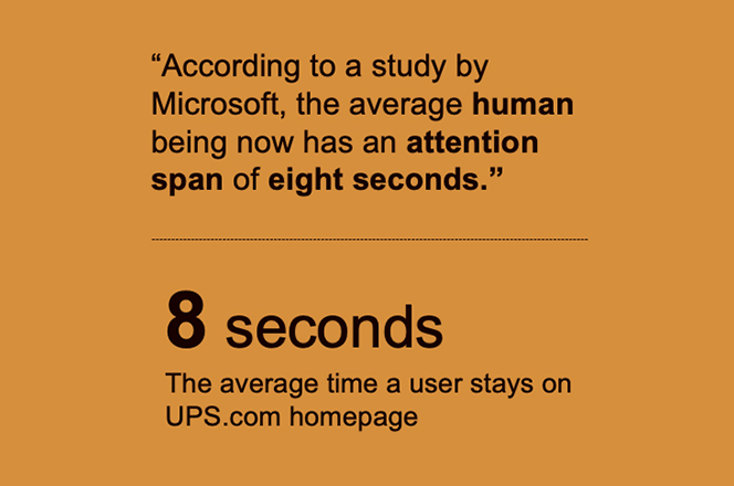
Using the “Amazon” testing approach, we created four variations with each variation introducing a new component to the existing homepage until it became an entirely new experience. This process allows for more data accuracy on engagement.
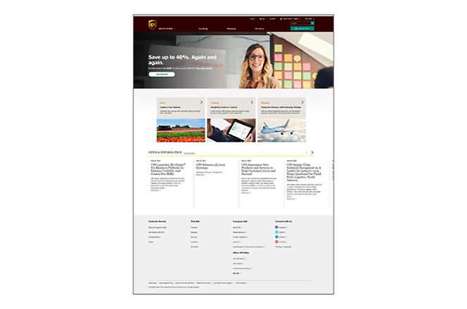
Variation A
Static Hero + Tiles
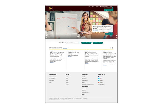
Variation B
Carousel + Utility Strip
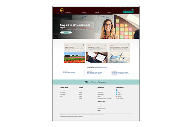
Variation C
Static Hero + Tiles + News and Information
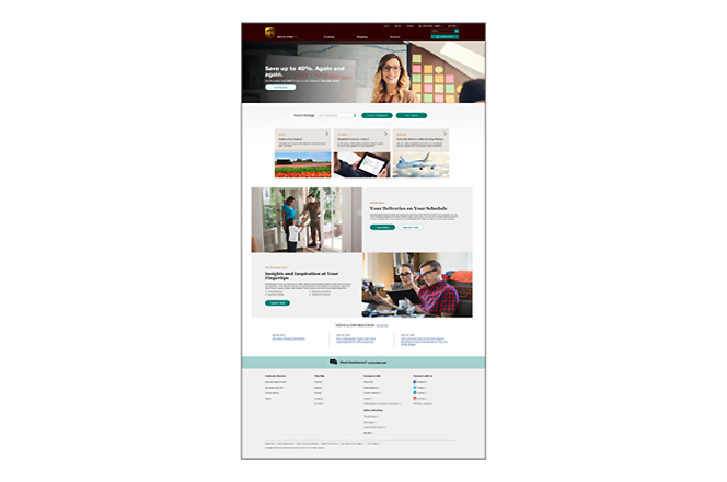
Variation D
Full Experience
The Results
1. Increased Engagement Performance
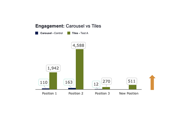
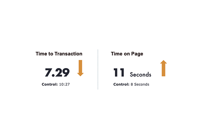
Variation A outperformed the carousel experience, driving a 22% increase in overall engagement and reducing time to transaction.
2. Improved User Flow Efficiency
Performance gains were strongest within key user flows, with Track improving by 20–30% and Ship increasing by 7%.
3. Utility Strip Optimization Opportunities
Variation B revealed opportunities for additional testing around the placement and effectiveness of the utility strip.
4. Data-Driven Design System Enhancements
Insights from this testing introduced a stronger process optimization approach and will help guide future design system enhancements and backlog prioritization.
Continued Evolution
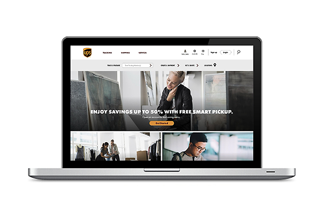
The next phase focused on testing the experience through a more modern and adaptable design system. Key improvements included introducing bold typography, a streamlined navigation menu, and a utility strip that made users’ jobs-to-be-done easier to access.
The design emphasized concise, user-focused language and a high-contrast color palette accented with recognizable UPS brand colors, creating a cleaner, more engaging experience across devices.
End State Proposal
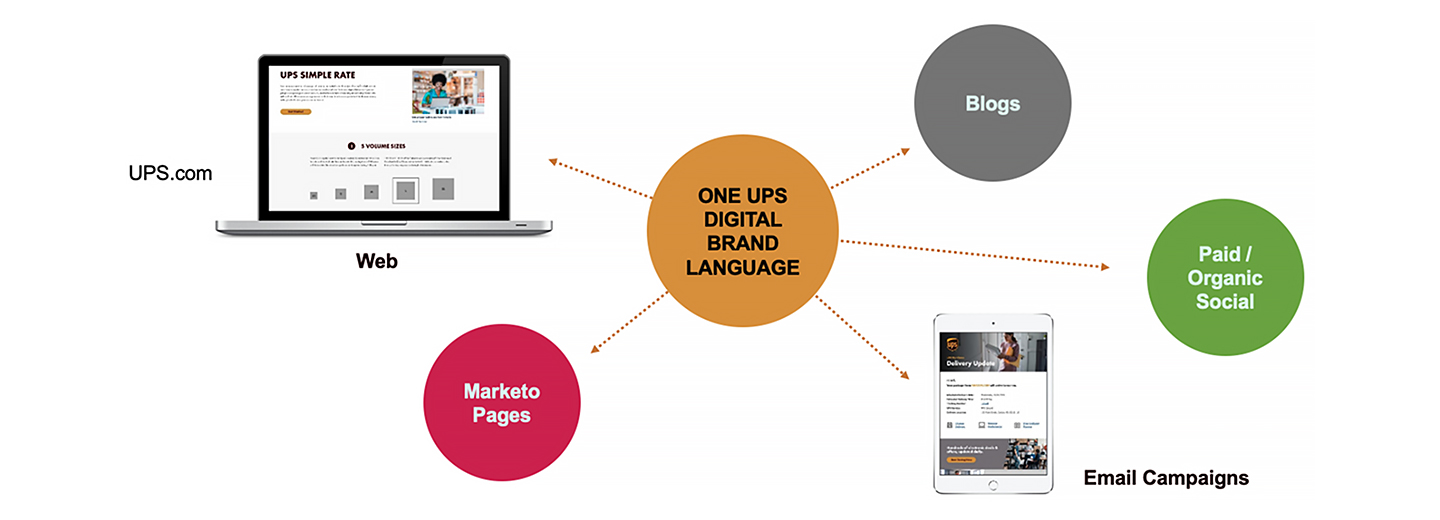
A Unified Branded Design Language for All Digital Touch Points